
/
Quick Menu & Icon Design
Quick Menu & Icon Design

Role & COntribution
role
UI/UX Designer Intern
Team
Me, 1 Mentor, 1 UX Writer, PMs, Devs, QAs, Cross‑functional stakeholders
Duration
3 months (Aug–Oct 2024)
Skills Applied
User & Market Research / Mobile Design / Multi-Platform UX / Design Systems / Developer Handoff
Core Responsibilities
Project Details
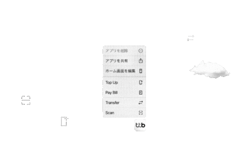
If you've ever pressed and held an app icon on your phone and seen a list of shortcuts pop up—that's it!
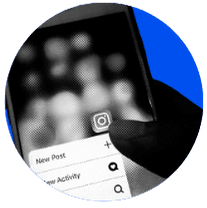
First introduced through 3D Touch on iOS in 2015, are now common across major apps (Instagram, X, Grab, LINE MAN, etc.)
Although optional, Quick Menus improve user flow efficiency by moving key actions from deep app navigation to your home screen help reduce the "Time-to-Value" for frequent tasks like Scan or Top Up

TIMELINE

APPROACH & PROCESS
Technical research
platform constraints
Mapped limits (max actions, system labels, icon formats) across devices and how they impact design and engineering
User research
behaviors & priorities
8 in‑depth interviews (45–60 minutes) with heavy and occasional users
42 surveys to rank “hero features” for a limited 4‑slot menu
Market research
competitive landscape
Platform research
Key Design Considerations
Device-based
Platform-specific rules
and system behavior
Space
1–4 actions
Used in fast,
often public contexts

Icon Design
SF Symbols vs. Custom icons
Stroke consistency
Dark & Light Mode support
Highlights
Slots: Typically 1–4 actions + system items (Edit Home, Remove App)
Must remain legible at very small sizes in both light and dark modes
Highlights
Flexible, typically 4–5 actions
Material Design with solid colors and adaptive icons

Approach
Uses unified stroke weights with system items and iconography that matches in-app design while remaining instantly recognizable at a glance for its function
User Reseach
Mixed-Methods (N=50)
• 8 in‑depth interviews (45–60 mins) with heavy vs. occasional users
• 42 surveys to understand the user journey, quick menu awareness, usage frequency, and user expectations
Target User Segments
1
Heavy Users
Key Pain Points
Use Scan / Transfer daily, often in public (convenience stores, transit)
Reported the full app as “too slow” for simple payments
Were frustrated by redundant authentication for small, frequent transactions
Solution
Reducing the time between intent and action
avoid unnecessary re‑auth when platform policy allows.
2
Occasional Users
Key Pain Points
Many didn’t know the Quick Menu existed
Needed clear, simple labels and a strong sense of control
Solution
Simplicity & clear visual cues
Single-tap activation
brand-consistent visual hierarchy
Safety & Control
Speed
relevance
High-value tasks
User preference vs. stats?
Speed vs. Trust
But is reduced authentication allowed under bank policy? Does it risk users’ trust?
Design Strategy
Week 1–3: Competitive audit (18 Thai banks/Fintech apps+ ttb flows)
Week 4–6: User research → BA discussions
Week 7–8: Platform/brand guideline review
Week 9–10: Hi-fi prototypes → Maze testing
Week 11: Icon polish → Dev specs
Week 12: Final handoff (later: implementation support via UAT)
Design Outcome
Final menu
1
Number of Items
Aimed at four actions based on platform limits and user preference
2
Action selection
3
Action order

Icon Design
Quick Menu icons are simplified versions of in-app icons, designed for clarity in a constrained context
iOS
SF‑inspired line icons that align with the bank’s visual language and Apple’s Human Interface Guidelines
Android
Circular icons with colored backgrounds for visual separation


Word Choices

Before/After Flow
Traditional Flow (~20 seconds)
step 01
Home
step 02
Open app
(splash)
step 03
Authenticate
step 04
Reach home
step 05
Find feature
step 06
step 07
Re‑authenticate when finished
Quick Menu flow (~11 seconds)
step 01
Home
step 02
Long‑press
app icon
step 03
Open app
(splash)
step 04
Start the
transaction
step 05
Authenticate once to complete the transaction
≈ 45% TIME REDUCTION
in test scenarios


Summary
Key Deliverables
1
Weekly Progress Reports
Weekly presentations to >100 stakeholders
2
Competitive & User analysis
Benchmarking against the Thai banking and Fintech apps landscape
REFLECTION
Key learnings
User Insights Drive Innovation
Including user quotes (not just numbers) sparks discussion. Field research led to deep understanding, enabling confident answers to questions, turning user pain into solutions and stories into innovation
Everything Is Designed
Icon work showed me: every detail, from pixels to products, is intentionally designed. This project shaped how I think like a designer and learned to look out for little details
What could be improved
Testing environment gap
Maze conditions ≠ real-world scenarios
User pool bias
Limited recruitment users in Bangkok and with the 50 users sample couldn't fully represent 5M users' diversity
