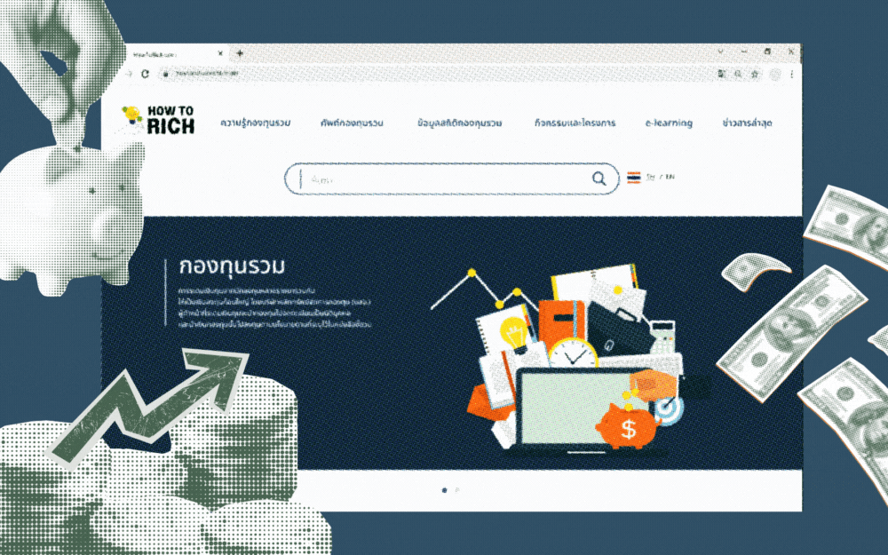
HowToRich
about the project
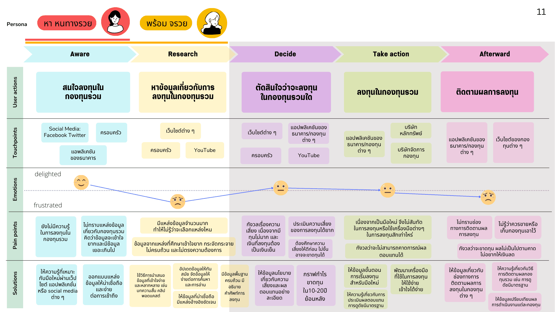
Persona


Biography
Earns 8–9k baht/month. Saves, tracks spending, risk-averse.
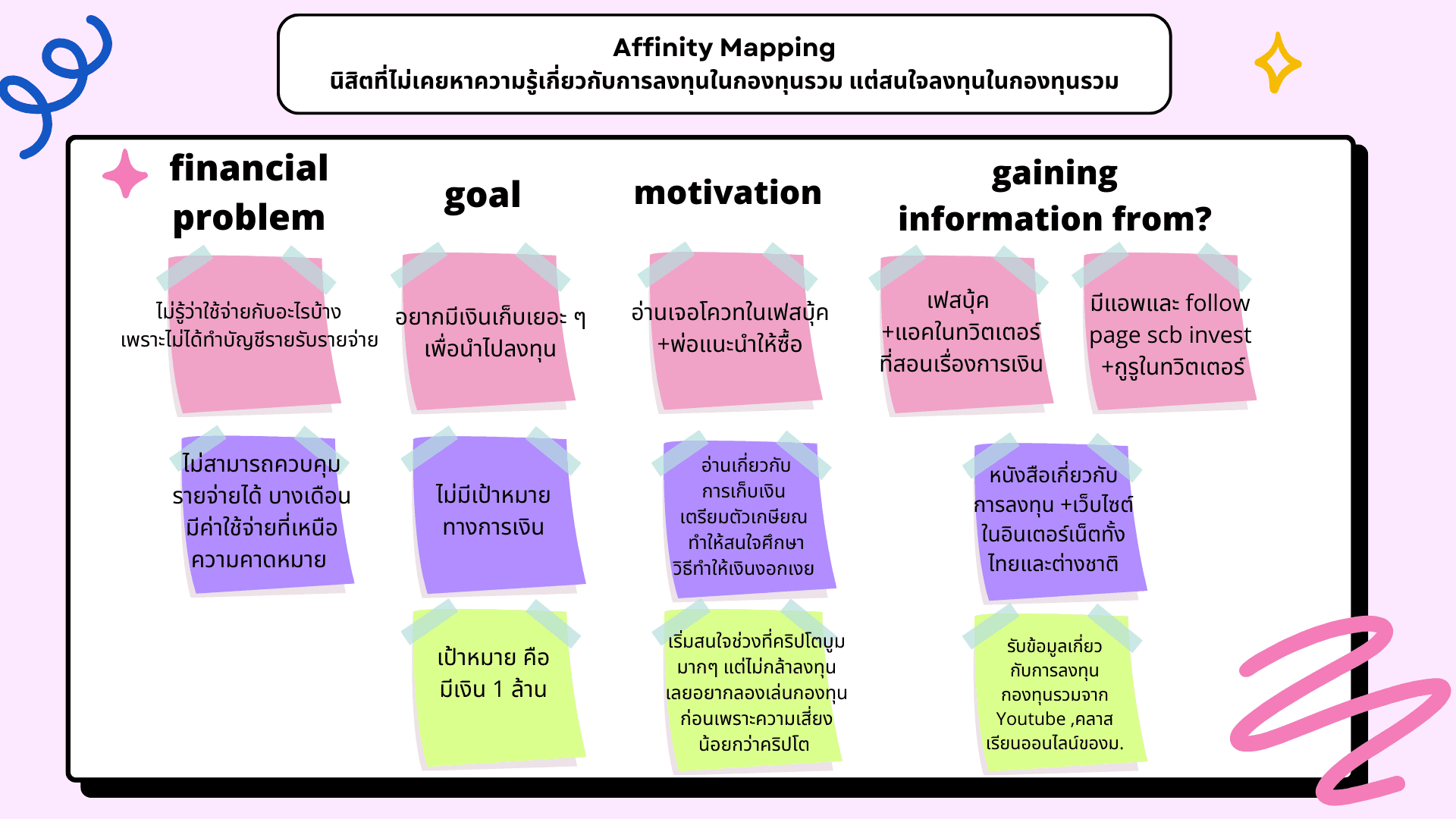
motivation
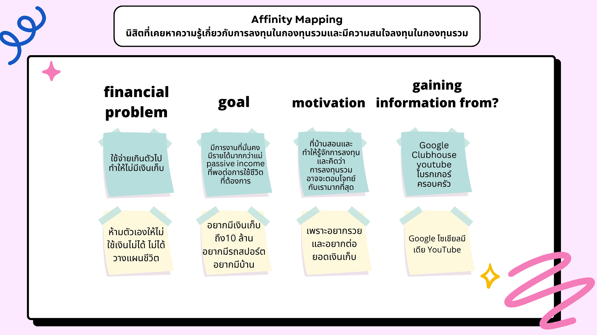
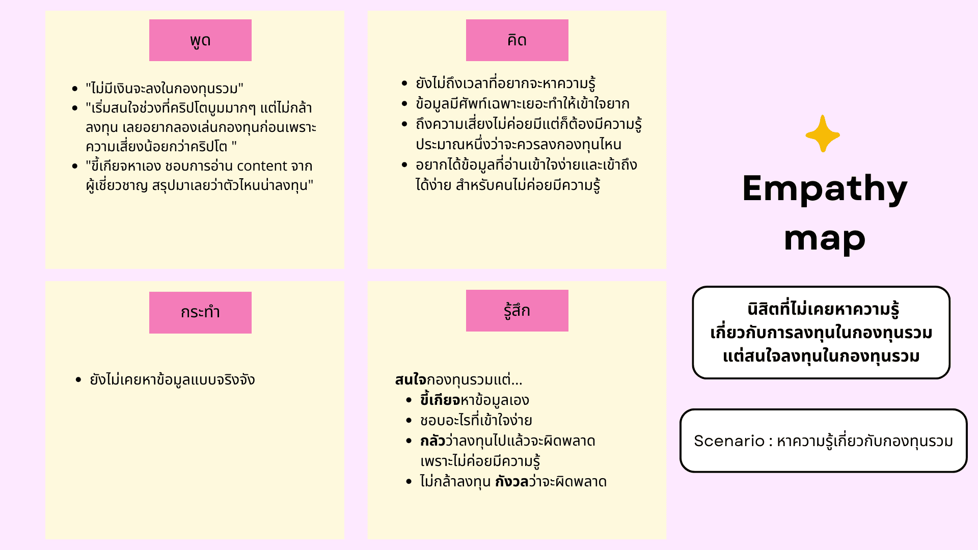
Interest sparked by father and social media.


Goal
Wants to save more and grow money.
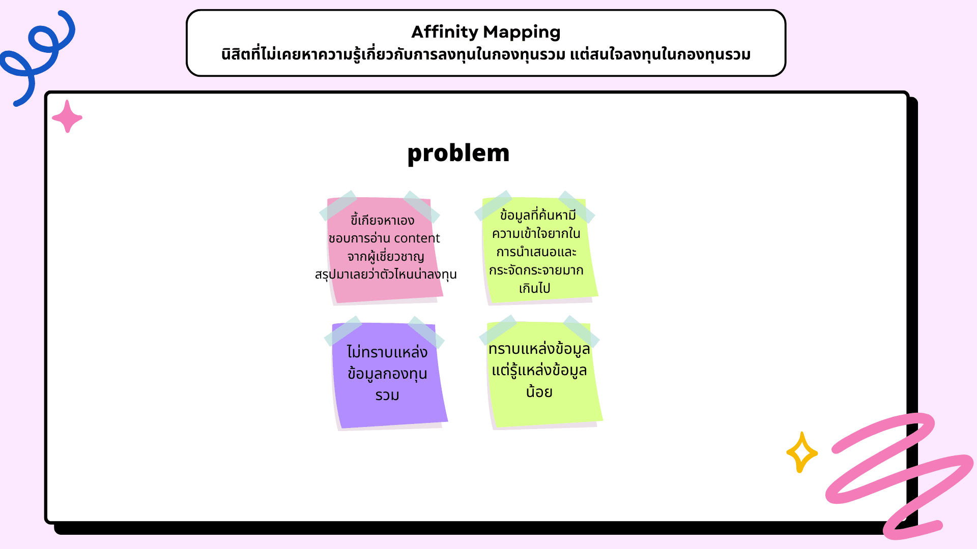
Frustration
Information hard to find, complex, overwhelming.
Worried about risk and lack of knowledge
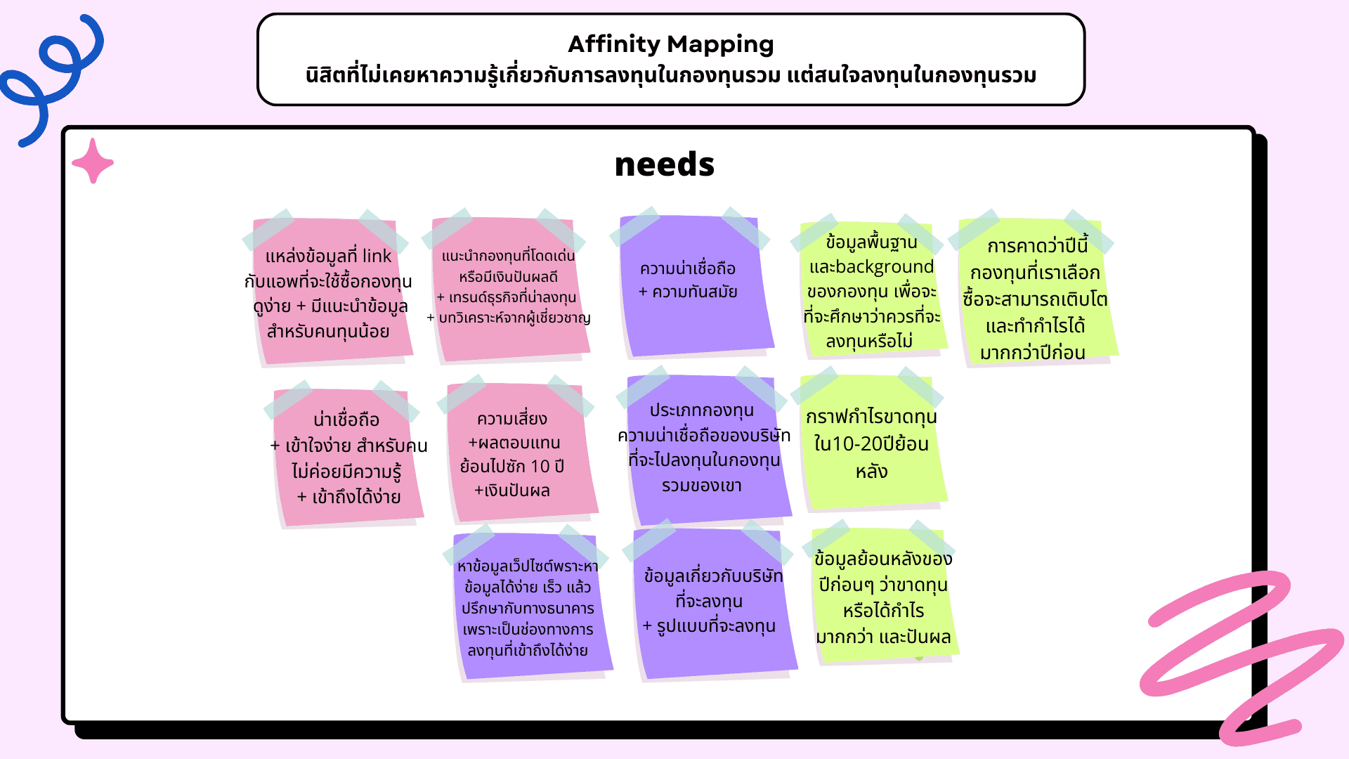
Needs
Needs simple, accessible, trustworthy basics tailored for small funds.

Student Who Has Sought
Mutual Fund Knowledge
Biography
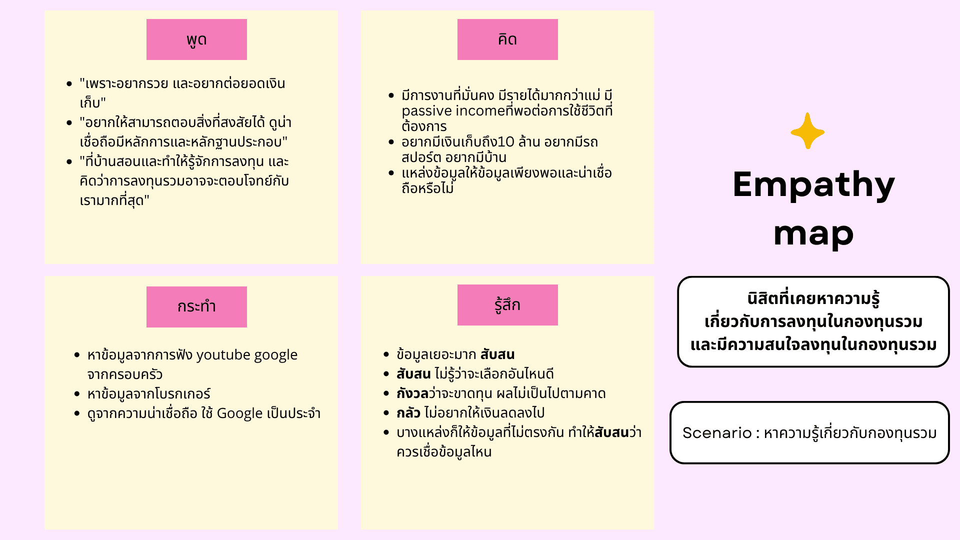
Earns 25k baht/month (family business).
Tracks expenses but spends impulsively, leading to low savings.
Invested previously, but stopped.
motivation
Motivated by family info; sees mutual funds as a suitable option to build future surplus.


Goal
Wants wealth, savings, and passive income for a desired lifestyle (buy without overthinking).
Frustration
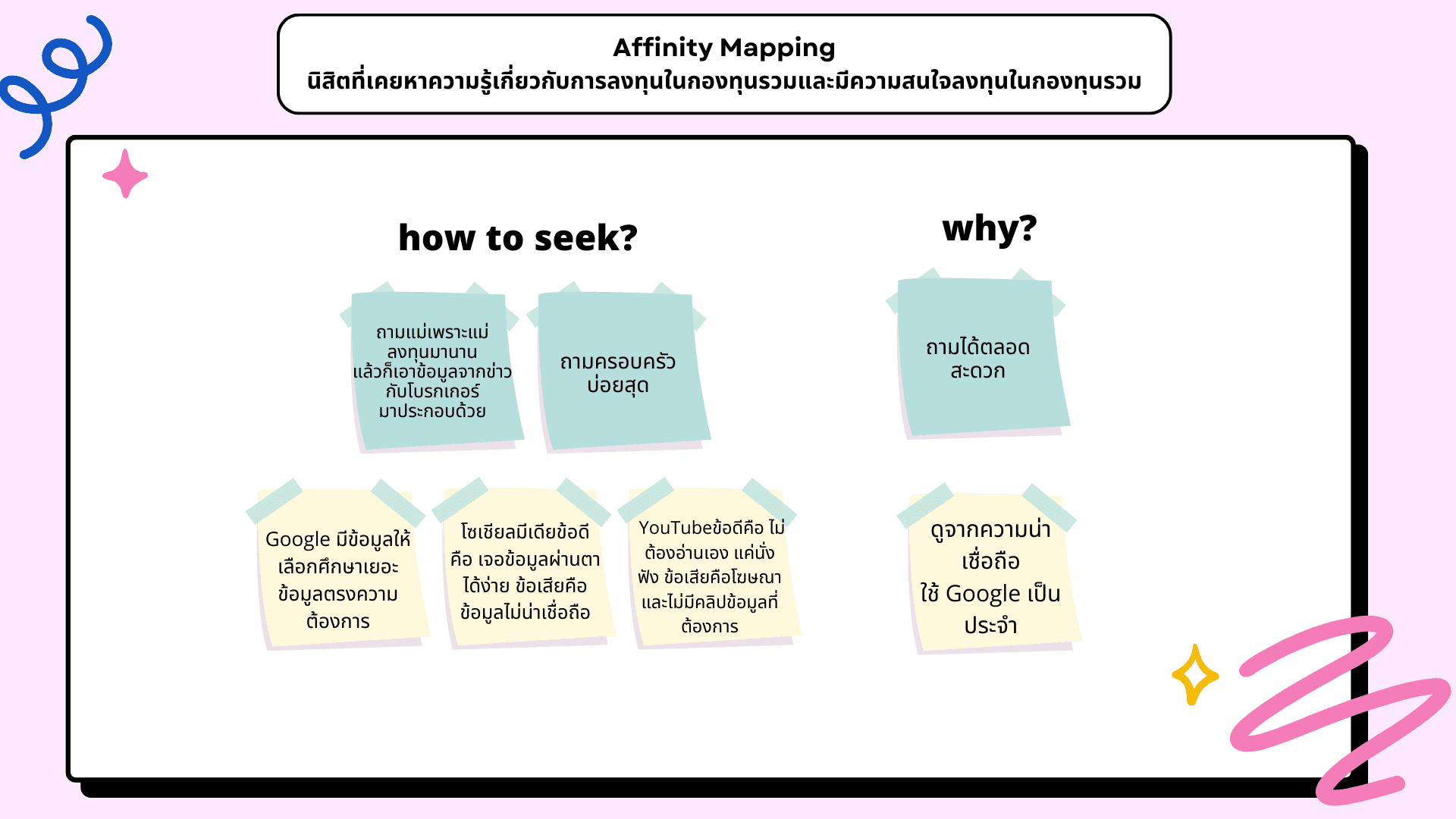
Information is conflicting, hard to verify, and incomplete. Worried about losses, needs thorough risk understanding.
Needs
Needs reliable, updated, detailed content on fund selection, risk levels, and news.
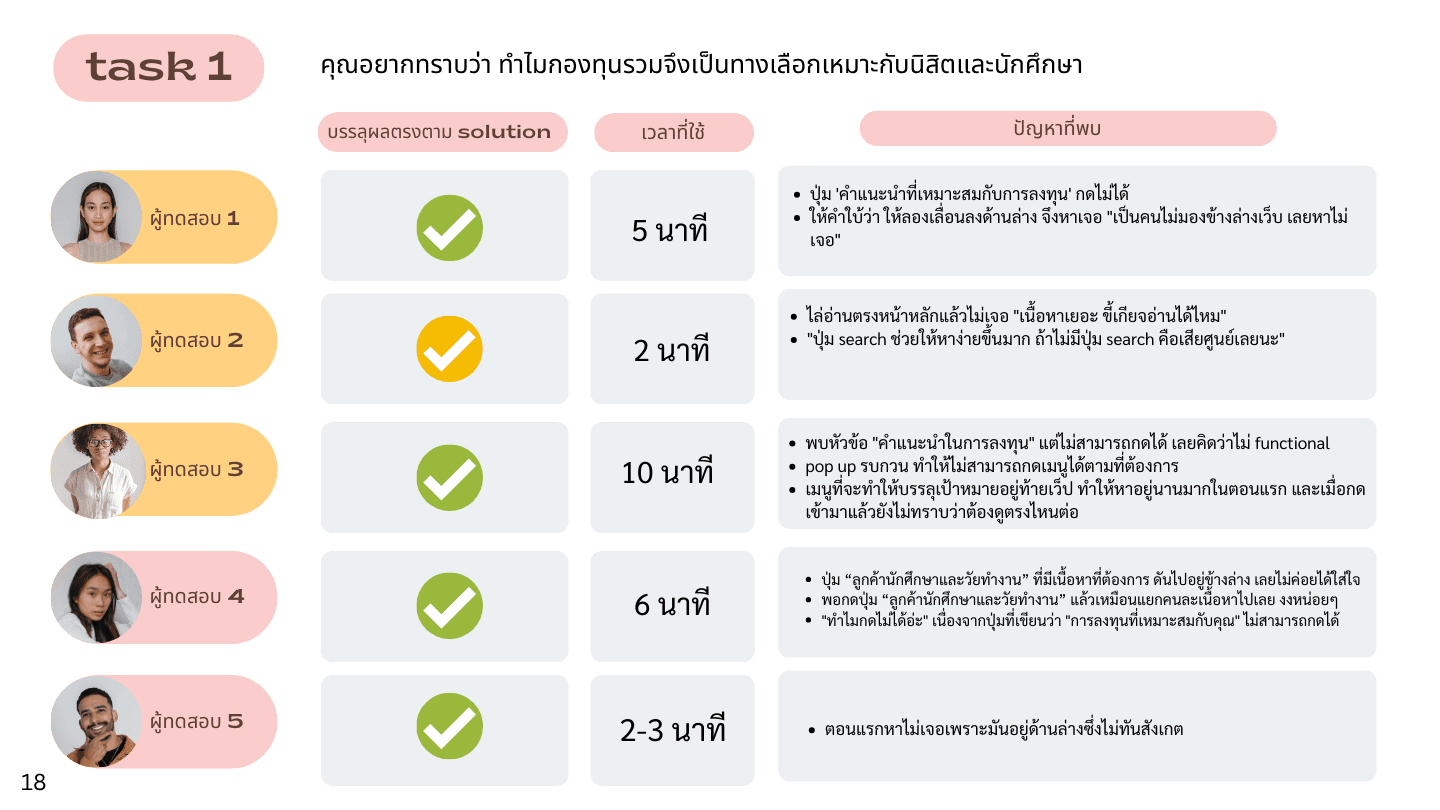
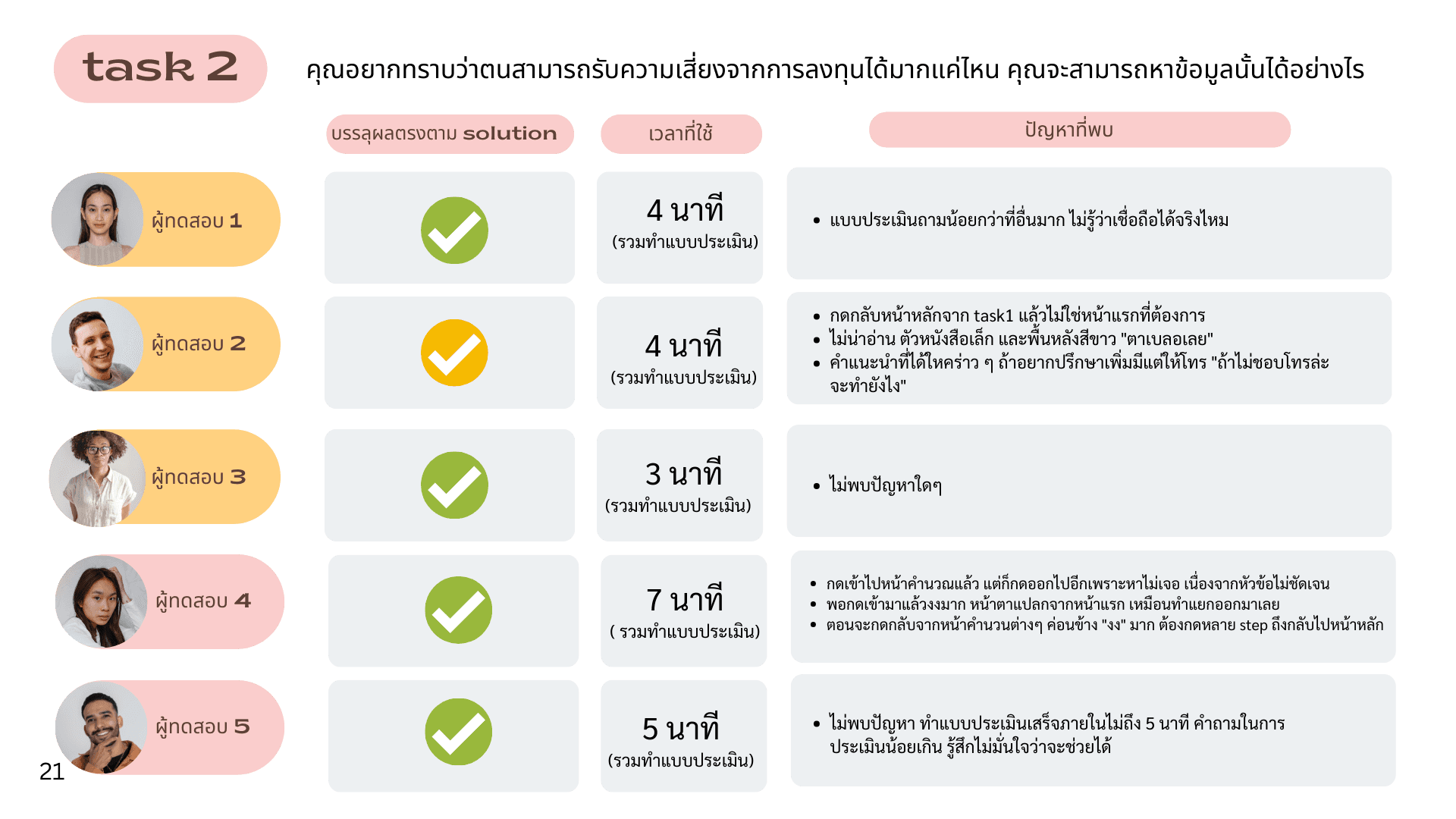
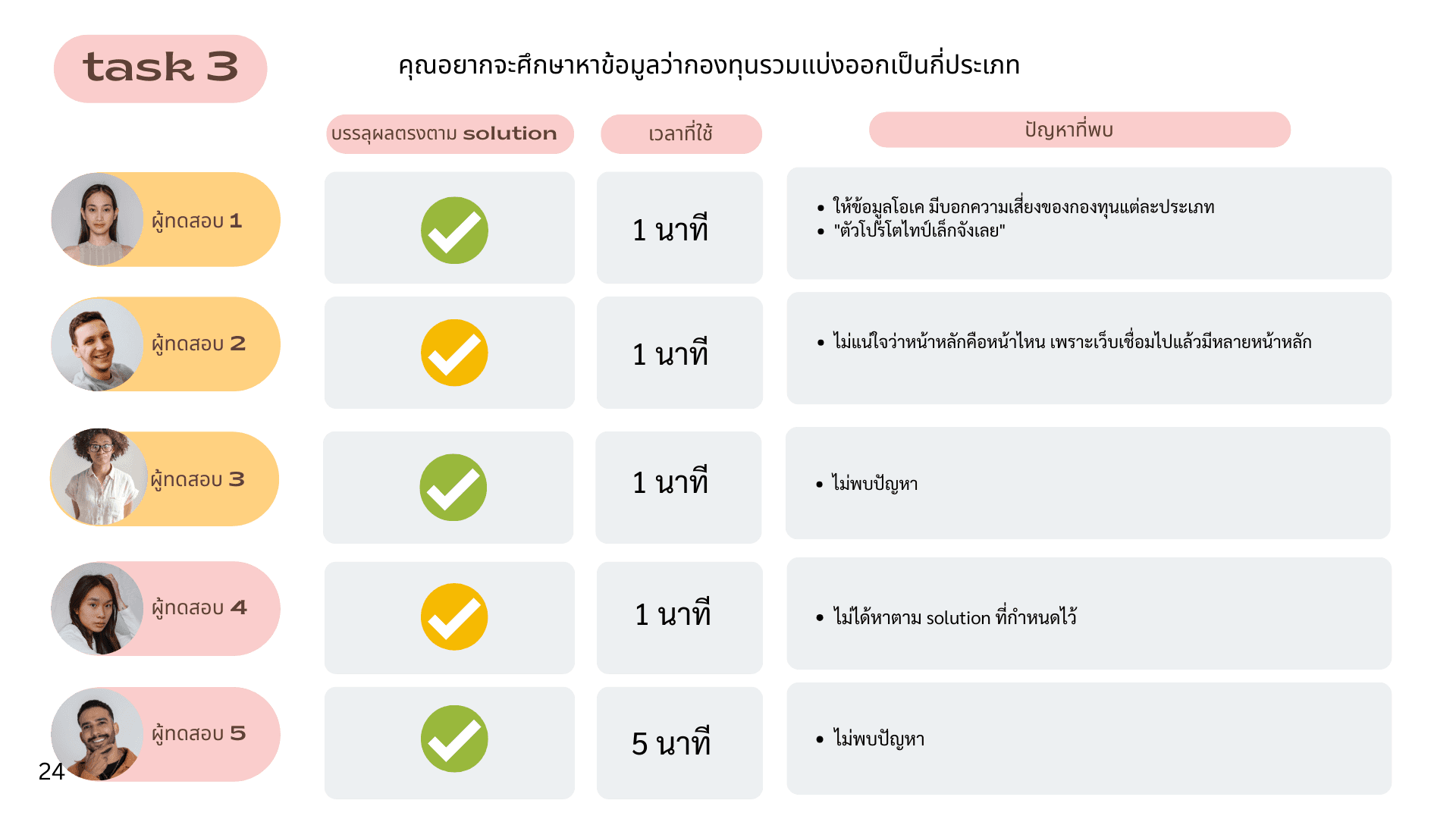

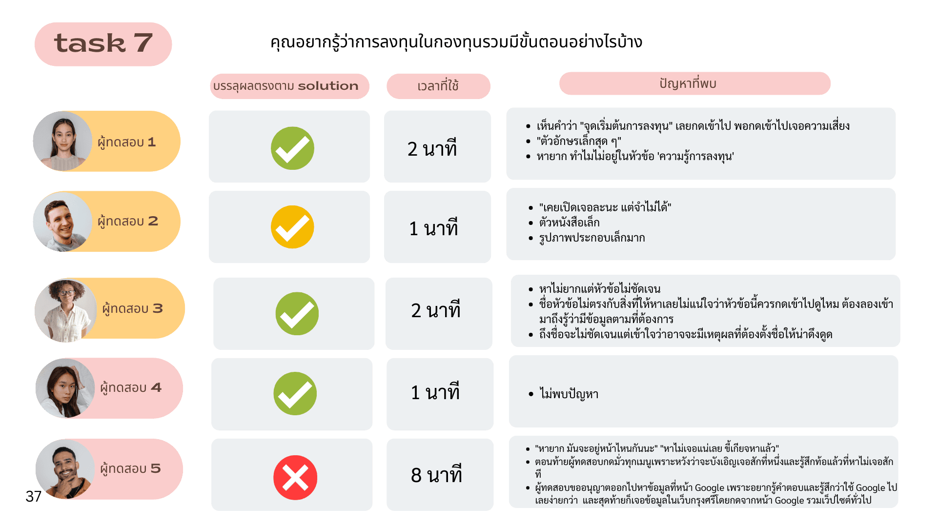
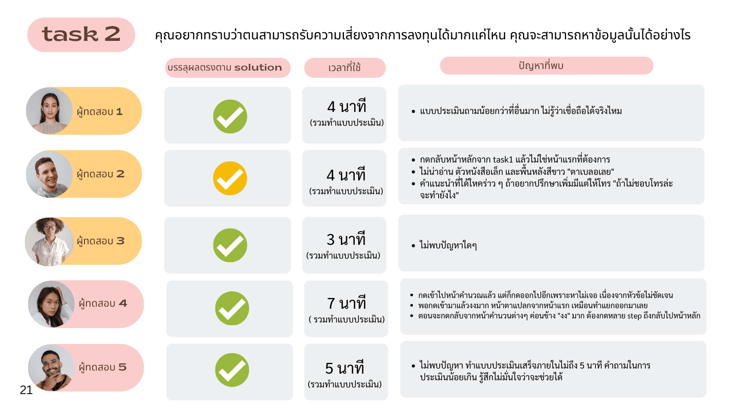
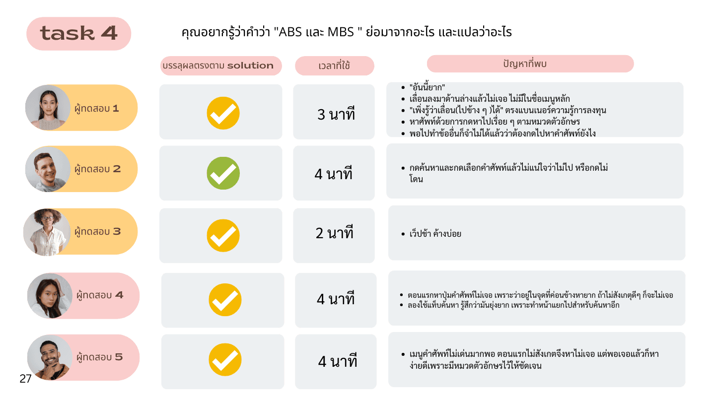
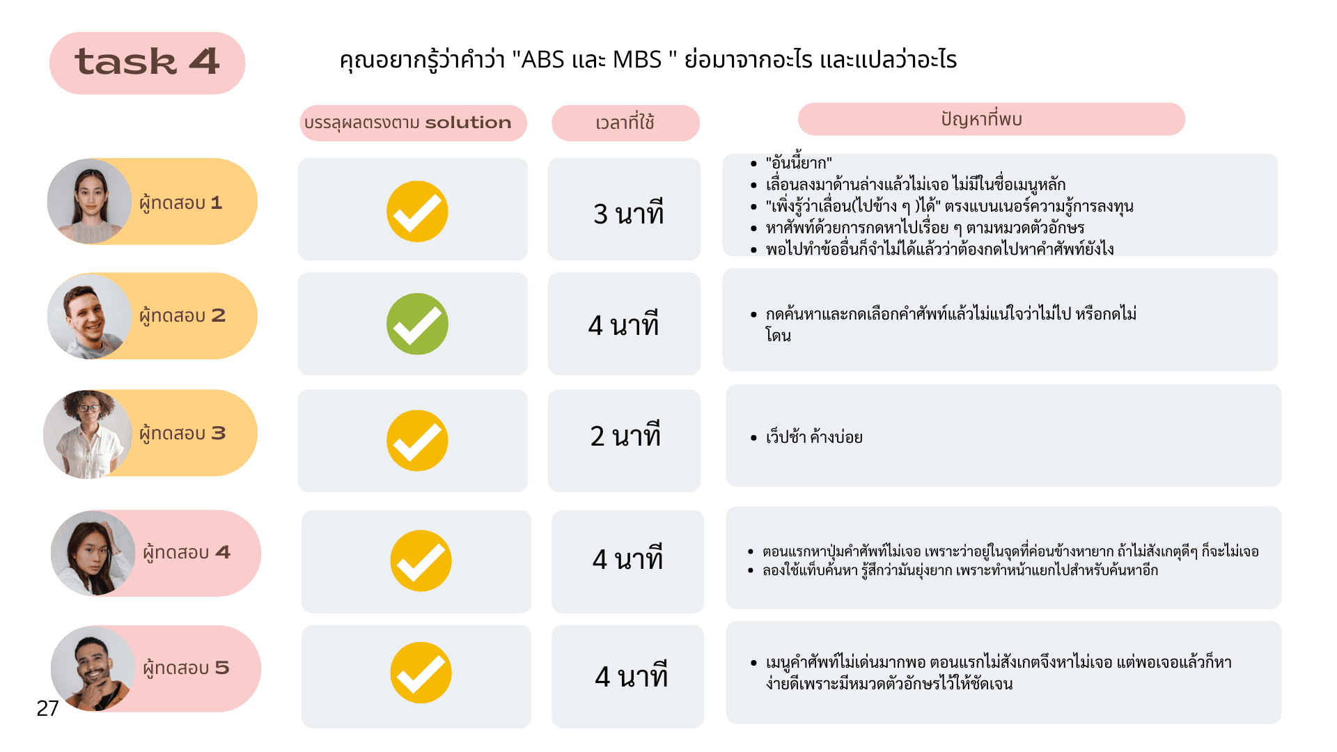
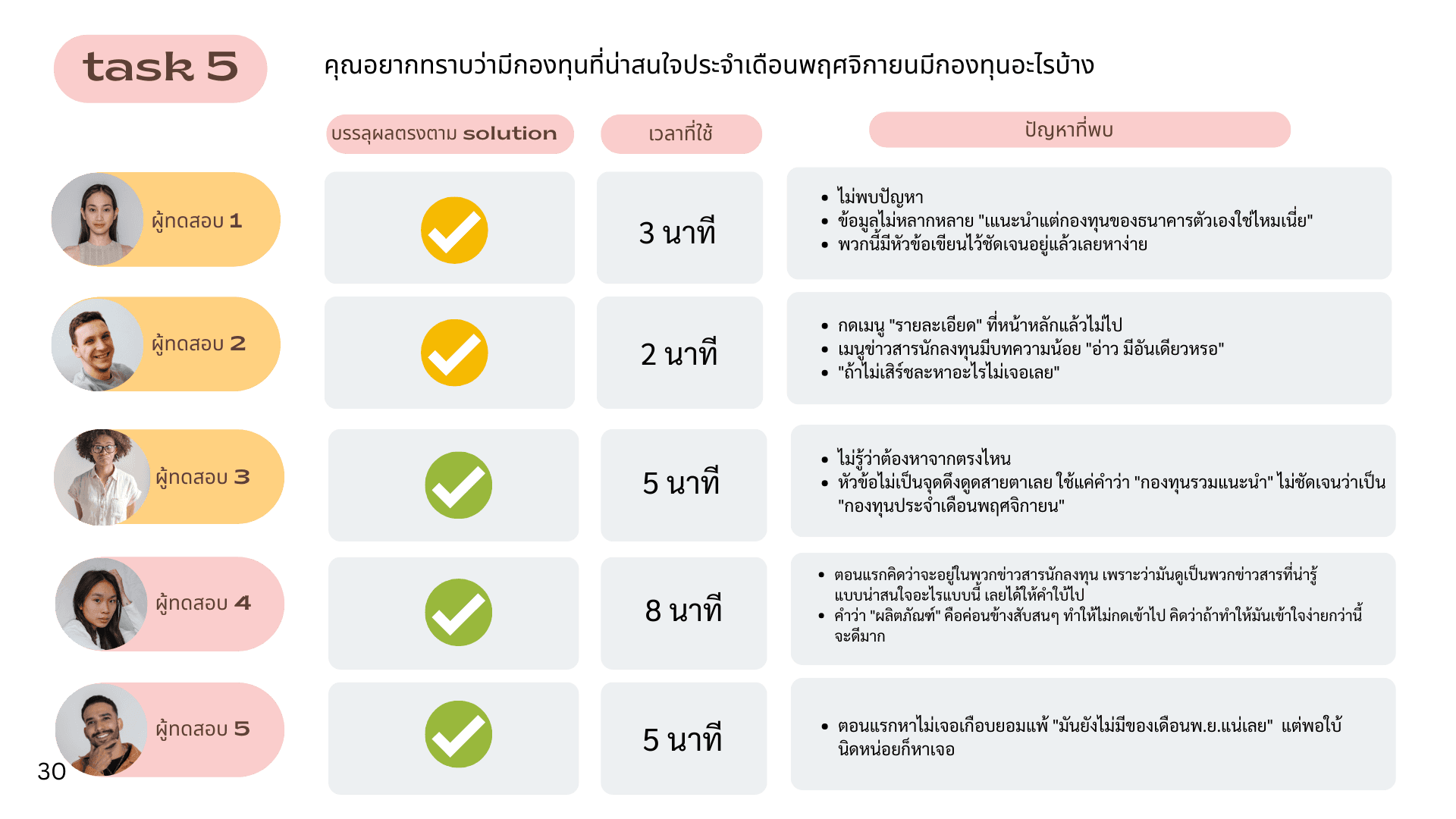
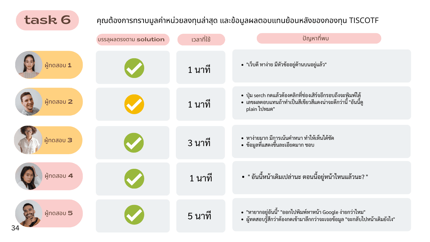

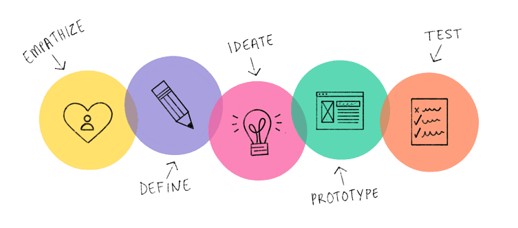
Task-based Usability Testing
Meeting with UX Writer to choose the word choices that match guidelines and user needs considering Space, Communicate with Users, Align with the app and not confusing with Competitor used words
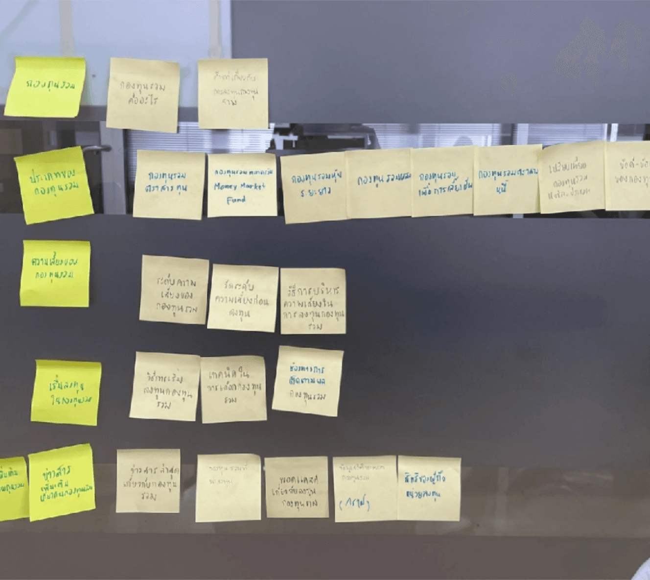
Research findings
The solution organizes content using familiar, user-centric categories to enhance comprehension, aligning the system structure with real-world user expectations and needs.
Information Architecture
Difficult to return to home; too many clicks
Related content not grouped intuitively
Search icon didn’t auto-focus input field
Key info buried; poor visibility and too many layers
Vague labels; copy didn’t match content intent
Encountered content needed but couldn't recall
Symbols for page changes confused users on how to proceed
Confusion after using search or selecting options about where it led
Risk assessment questions seemed too minimal, causing uncertainty about their helpfulness and reliability
Some pages had extensive, unreadable content with small text and no color variation
Limited news articles for investors, advice suggesting only bank-owned funds
Lack of guidance on where to start
non-functional buttons related to content
Key Takeaway
What I learned
I gained a deeper understanding of UX/UI concepts by going through the full design process. From literature review, user interviews, and usability testing to creating personas, mapping user journeys, and designing information architecture, I learned how to identify and solve key issues. The project wrapped up with a working prototype and a comprehensive usability plan.